For those of you who get totally bored, bemused, befuddled by clicky things and worse still post click production, workflow is what we apprentice geeks have been told to refer to it as. This blog will drive you to the soaps quicker than the no smoking ban drove me from the pub. So I don't feel I've led you here under false pretences below are a couple of amusing signs as a small compensation.
I WONDER HOW LARGE NOAH'S SIGN HAD TO BE
HEY KIDS, WERE' R ON HOLIDAY FANCY A SWIM?
What I'm going to attempt to do is covert this;
To this;
I can hear it now, I'm almost deafened by cries of 'Why the hell bother!'
I use Photoshop Elements 7, Elements 6 is to all practical purposes the same and for you lucky folk with the full version you have channels to play with as well. Now there are several quick ways of desaturating an image. The basic method is to open the image in editor pull a Hues/Saturation adjustment layer and drop the saturation to zero. Moving up a step in the control stakes we have the convert to black and white option under Enhance, this is pretty good but PS have forgotten to make it available as an adjustment layer. This effectively means that it can't be applied to selected areas of the image..meanies. So the alternative, it's a little more work but only takes a few minutes. Takes bloody hours to get all these screen grabs but here goes.
This is all, or almost all layers so to give yourself some room collapse the pallet bin. You can drag the Layers pallet where you like. Select a Hue/Saturation adjustment layer, just click OK. Go to blend mode and select Colour, it's down at the bottom somewhere.
Select another Hue/Saturation adjustment layer, make sure it's at the top of the stack, if not drag it there. Move the Saturation slider all the way to the left and click OK.
Double click on the original Hue/Saturation adjustment layer and move the Hue slider to the left to increase the blues. A value of -140 or more should increase the drama, the choice, as always is yours. Click OK.
Select a new layer, make sure colour swatches are black to white. Select Gradient tool, select Foreground to Transparent and the linear option. Then hold down the Shift key whilst dragging from A to B. The shift key isn't critical, it just constrains the gradient to vertical. The sky should now look much more dramatic. If it's too much reduce the opacity if not enough click on the layer and duplicate it.
Almost there, a bit of tidying, the sky is now much more dramatic, but it's reflection in the tarn has not been replicated. So a little burning is required, the tops of the hills on the skyline are a touch dark from the gradient so they need dodging or lightening. Hold down the Alt key and select new layer, select blend mode as overlay, select fill with 50% gray. and click OK.
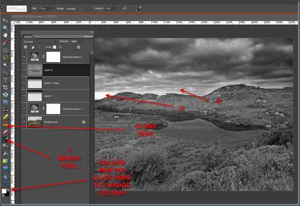
Now we can start dodging and burning, select the brush tool select a nice soft edge set opacity to 10%/20% pick black from the colour swatch and paint on the pond water. You can make several passes, use ctrl.+Z to undo, or if you make a real dogs dinner you can delete the layer and start over, to dodge the horizon pick white as your colour and paint on the dark bits. When you get more confident you can increase the opacity which speeds up the job.
We or at least I have a wee problem at A so to tidy the light bit of sky I'm going to clone sky from B and paint into area A.
For this we require a visible layer, so hold down ctrl+alt+shift + E, stamp visible command. Select the clone stamp and from options, mode normal and opacity 50% or thereabouts. Press the alt key and click on some sky around A move to the bright area and paint. Again if you mess up just press ctrl+Z. To quickly adjust brush size press [ for smaller and ] for larger. This works on all paint type tools.
Select the background layer and drag it to the new layer icon, it will probably copy itself above the background layer, just drag it to the top of the stack and reduce it's opacity till you get as much or as little colour replacement as you desire. The observant amongst you will notice that the screen grab above is not quite as vibrant as the final image I posted at the top of this blog. That's because I selected bits and pieces of the image and further enhanced or at the least altered the selections. I'll carry on and do that for tomorrow as time is marching on. Happy Clicking.


No comments:
Post a Comment