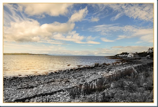
Feel free to give me a bashing. Whilst you are bashing please remember we are entering the season of goodwill to all personkind and I’m still a bit delicate.

John at MIDMARSH JOTTINGS posted a mistake I found appealing. This technique has possibilities but I have yet to find them despite an hour messing about. John’s worked well I thought. As usual I have picked the wrong image to play with. It can be fun being a lunatic.
Have fun.

It looks a bit of a fantasy to me. That's good for our imagination if not for our grip on reality.
ReplyDeleteDavid, as you realise fantasy is good.
DeleteI actually quite like that image Adrian especially the light on the water surface
ReplyDeleteDouglas, I just enjoy playtime.
DeleteI like it! No bashing from this quarter ~
ReplyDeleteThanks Glo.
DeleteEven I noticed the tilt this time :) I kinda like the colour/bw thing though.
ReplyDeleteMonica, my first job is to straighten but when i start messing about I do tend to forget.
DeleteAdrian is very easy they say (if you can), but I do not dare me to.
ReplyDeleteBas, I have spent years with Photoshop and still have at least half of it to learn.
DeleteWell, I liked it a very lot! Ask Graham to explain that sentence!
ReplyDeleteThe sky is just lovely. The technology of it all is way, way over my head but I love it.
Well, I liked it a very lot! Ask Graham to explain that sentence!
ReplyDeleteThe sky is just lovely. The technology of it all is way, way over my head but I love it.
Well, I liked it a very lot! Ask Graham to explain that sentence!
ReplyDeleteThe sky is just lovely. The technology of it all is way, way over my head but I love it.
Well, I liked it a very lot! Ask Graham to explain that sentence!
ReplyDeleteThe sky is just lovely. The technology of it all is way, way over my head but I love it.
Thanks Spesh.
DeleteThe software is often over my head too.
I gather, Spesh, that you liked it a very lot! Were you being slightly impatient with a slow Blogger by any chance? As for Adrian's photo (sloping horizon apart) I actually thought it was interesting too.
ReplyDeleteGraham, this is going better than I thought. I was expecting dogs abuse.
DeleteOne of my favourites. I don't know what you did to it, but I also like it a very lot.
ReplyDeleteKatherine if you have selection tool in your editor then all one does is select an area then convert to B&W. I had to pop a mask on to clean up a bit. It would have been better if I'd spent longer on it.
DeleteThe nice thing is that you can straighten the photo at any time. Interesting affect.
ReplyDeleteHorst, I would have to chop the border off first but yes it isn't a big job.
DeleteIt looks like a paint!
ReplyDeleteLaura, it does look a bit like paint but nothing like as good as your paintings.
DeleteHi Adrian. apart from the tilt, I like it but not having seen the original I have not idea what changes you have made.
ReplyDeleteMargaret, I just converted the selection to B&W.
Delete'Tworked quite well technically. The technique is possibly more suited to twilight situations where the foreground would be darkish anyway. It is a good way of concentrating the attention where you want it.
ReplyDeleteJohn, yours worked better so I agree that twilight would be better.
DeleteOne of my sayings is, "it helps to be a little crazy!" So it takes a different look at things to come up with something new.
ReplyDeleteRed, Some times things work, sometimes they don't. This has possibilities.
DeleteSeems you're getting off lightly Adrian?...So, here goes......Fantastic image, I really like the split b/w and colour idea.
ReplyDeleteHowever, I'm thinking maybe it would work better if you cropped off the bottom third, the busy foreground holds your eye for too long... from where the shore line and the sea meet the left hand side... that would then give a better lead in line to the buildings...maybe lighten them up a bit as well? That's all!!
Oh!...and there's just one thought...You'd best hurry up and rectify it before the sea drains away down the right hand side!...[;o)
Trevor, I thought I'd had a narrow escape.
DeleteYes all your suggestions are valid.
Straightening and lens correction are usually early on in my work flow.
I always forget when I'm playing around.
Loving the colours & textures. I probably wouldn't have noticed the horizon unless you said … the season of good will and all that !
ReplyDelete